ING open sources Lion

TL;DR: Web development can be hard, whether you're making your own components, implementing Design Systems, support many different browsers, incorporating accessibility, or adding third party dependencies. Lion aims to make your life a little bit easier, by taking the groundwork of feature complete, accessible, performant, and framework agnostic components out of your hands! Check out the repo at ing-bank/lion.
As some of you may already know, ING has a long and rich history of building Web Components, starting out with the Polymer library, all the way up to the recently released LitElement.
Need a refresher? Web Components are a set of browser standards that allow us to write browser native, reusable, encapsulated, and modular components.
Web Components standards have finally matured, and today, there are many ways to build and consume your Web Components, like: Angular Elements, Stencil, Vue, Svelte and many, many more. And with the release of the new Chromium Edge, this means that all major browsers support Web Components natively.
So today, I'm happy to share with you all that ING is open-sourcing its own core library of Web Components: Lion! 🎉
Why Lion?
Imagine the following fictional scenario:
Lea is a developer who works at Betatech, and is working on a new in-house application.
Framework Agnostic
Finding components is hard, and can lead to a lot of frustration.
Lea finds a perfect component for his use case, but unfortunately, it's written in a specific JavaScript framework, and Betatech uses a different framework, so sadly she's not able to use it.
Additionally, companies have their own visual identities and overriding fully styled components to make them look like the companies identity, can sometimes be more work than start styling from scratch.
Lea finds a component that offers all the needed functionalities, however, it looks vastly different from Betatechs identity.
Customize Functionality
Once you've found your perfect component, at some point down the line you may discover that the component lacks some kind of functionality that you would like to achieve.
Lea decides to copy over the code of a component she found, and implement the feature herself, and as a result now has to maintain the entire component as well, which becomes an added burden to the project.
Accessibility
Your components should be usable by every kind of user. Accessibility is hard to get right, but an essential feature, additionally, accessibility issues can be impossible to fix at a later stage without breaking changes, so it is crucial to incorporate accessibility right from the start.
Somewhere down the line, Lea finds an accessibility issue with a component she found online. she can't fix this issue in his code, so she asks the maintainers to help her out. They tell her they can't fix it because they don't want to do a breaking change.
Or, alternatively
Lea writes her own component, and the accessibility issue is hard to fix because of the way she initially wrote the HTML structure, and will also lead to a breaking change.
Summary
Does Lea's story feel relatable?
It highlights multiple common issues in modern web development:
- Finding and adding a dependency is a big deal
- Picking something because of looks alone might not always be the best choice
- Adjusting behavior or styling can be tough to maintain
- If a package is popular it doesn't mean it has good accessibility or performance
What can we do to tackle these issues?
🤔 Imagine having components that purely focus on functionality, and leave the design up to you
🤔 Imagine that these components come with great accessibility and performance
🤔 Imagine these components are highly extendable and flexible
Now stop imagining, and look at Lion 🦁
What is Lion?
We want to bring the web forward - one component at a time.
Lion is a white-label, open-source, framework-agnostic component library, and can be the foundation for your codified in-house Design System. Aligning on design and usability is already a tough challenge, with Lion, we hope to take some of the work out of your hands.
White Label
Lion is a core package of white label Web Components. What this means is that the core components only consist of very minimal styling, yet has all the fundamental functionalities. White label products are often created so others can easily rebrand them with their own visual identity. This is great because it means that everyone can use the core functionalities of our components while bringing their own branding or Design System because surprisingly, not everyone loves orange.
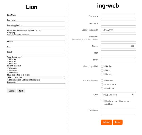
And this is exactly what we at ING do as well. Our very own ing-web components extend the Lion components and apply our own ING visual identity which mostly is a thin layer on top of Lion.
Check out the Lion demo's. Looks plain, doesn't it? And now compare Lion to ing-web:

🎯 Focus
Lion was designed with a focus on global usage and reusability in mind. And as such, the following features were incorporated right from the start:
♻️ Reusability - Our components are meant to be distributed and used on a global scale
🚹 Accessibility - Our components are meant to be accessible for everyone
🚀 Performance - Our components are meant to be small, performant and fast
These features allow us to roll out our components globally and have a single point of truth. It ensures that everyone in ING has a solid set of building blocks to build their application with, and get up and running in no time.
Lessons learned
ING started using web components very early on, and Lion is not the first component library we built. So you may wonder, how are these components different from the previous generation?
Lion is built from the ground up to allow for accessibility and extendability as we learned that these things are almost impossible to change/achieve at a later point in development. We'd like to highlight a few of the lessons learned while making Lion:
- Not everything has to be a Web Component, for certain functionality regular JavaScript is better.
- Stay as close to native semantic HTML elements as possible.
- Incorporate accessibility from the start.
- Not everything needs to be in the shadow DOM, this is especially important for aria relations and accessibility.
- UI components are hard
Everyone should use web components but not everyone should write them
🙋 Join us!
Adopt Lion!
Lion can help you implement your Design System by providing a white-label, functional, accessible and performant foundation for your component library. All you need to do is bring your own design! So if your company is looking to codify your Design System, Lion makes a great base to start from.
Alternatively, you could use Lion to create a web component version of your favorite design systems, such as: Bulma, Bootstrap, Material, Bolt, Argon, Tailwind.
Additionally, the more users and contributors Lion has, the more stable the Lion base will become, which helps everyone who uses Lion.
Contribute to Lion!
At the time of writing, Lion is still in beta phase. We'd love to have your feedback before going to a stable release, so: Do you like open source, and do you want to help Lion out? You can do so by:
- Reporting/fixing issues
- Working on a completely new component (start with an issue for discussion first)
- Improving documentation
- ... every contribution counts! Even typo fixes in the docs 🤓
Feel free to create a github issue for any feedback or questions you might have. You can also find us on the Lit & Friends slack in the #lion channel.
You can join the Lit & Friends slack by visiting https://lit.dev/slack-invite/.
🔨 Extend the components
You can use Lion as the base to implement your own codified Design System.
Let see how Lea's story would have panned out if she would have chosen Lion instead.
First, install what you need
npm i lit-element @lion/tabs
Create a lea-tabs component by reusing the functionality of Lion. This gives Lea all the functionality and accessible core that she needs for his custom tabs component.
import { css } from 'lit';
import { LionTabs } from '@lion/tabs';

export class LeaTabs extends LionTabs {
  static get styles() {
    return [
      ...super.styles,
      css`
        /* my stylings */
      `,
    ];
  }

  connectedCallback() {
    super.connectedCallback();
    this._setupFeature();
  }

  _setupFeature() {
    // being awesome
  }
}

customElements.define('lea-tabs', LeaTabs);
Lea also wants to be able to style the tab and tab-panel according to Betatechs visual identity. In order to do so, she creates a lea-tab-panel component and a lea-tab component, which she can then fully style however she desires, and eventually place inside the lea-tabs component. You can see how Lea achieved this in the example down below.
import { LitElement, html, css } from 'lit-element';

export class LeaTab extends LitElement {
  static get styles() {
    return css`
      /* my stylings */
    `;
  }

  render() {
    return html`
      <!-- dom as needed -->
      <slot></slot>
    `;
  }
}

customElements.define('lea-tab', LeaTab);
Excellent! Lea can now use the tabs component like so:
<lea-tabs>
  <lea-tab slot="tab">Info</lea-tab>
  <lea-tab-panel slot="panel"> Info page with lots of information about us. </lea-tab-panel>
  <lea-tab slot="tab">Work</lea-tab>
  <lea-tab-panel slot="panel"> Work page that showcases our work. </lea-tab-panel>
</lea-tabs>
There we go, Lea's component is already done, so let's write some documentation. See the live Lea tabs documentation page. You can see the full code of lea-tabs on github.
P.S.: Do note that Lea is now responsible for keeping the documentation of lea-tabs up to date herself, and improvements on Lion's documentation will not automatically be reflected on Lea's documentation.
Why Open Source?
Component libraries are in huge demand. By open-sourcing our extendable components, we help people to do your thing, while reaping all the benefits from the open-source community. What's more, is that any contribution made to Lion directly impacts and benefits every design system using it (including ing-web) on a global scale. This means we get the best of both worlds by helping people with our components, and getting valuable contributions from the community!
Take a look at our repository! and if you wanna stay up to date be sure to watch and/or star it - there is no twitter (yet) but you can follow me Thomas Allmer - hey there 👋
But there's more!
Building applications is hard, and sometimes, you need a little bit more than just the right component alone, but also things like: Validation, Forms, Overlays, Localization, etc. But fear not; Lion has got you covered!
You can check them out in our documentation, and we'll go into more depth about Lion's additional systems in future blog posts.
Thanks
Finally, we'd like to close this announcement by saying a few thank yous:
ING, for giving us the opportunity to work on this project, and make it great together with the open-source community.
Everyone who has worked on Lion (especially the Lion team), including all the contributors (36 contributors and counting!).
And last but not least Pascal Schilp, for turning my scribbles into a followable story.